Call Me By Your Name
Typography Exploration
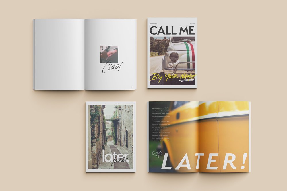
When choosing a novel for this project, I had to keep in mind how to combine typefaces, develop methods to achieve a clear hierarchy and visual interest. I chose to use Andre Aciman’s Call Me By Your Name where I hoped to highlight the tone of the novel through the treatment of typography through the use of grids, scale relationships, alignments, and effective negative space.
GETTING STARTED
FINAL PRODUCT
LAYOUT DIRECTIONS
After picking the novel, it was time to play around with what direction I wanted to take through mapping out different layouts. The first layout added handwritten elements and the second had a more modern, luxury feel. Option one became the clear winner.
Now that I had settled on the direction I wanted to take, I knew I had to have some handwritten elements to accompany the typefaces I had chosen for the project. I
took inspiration from the film adaptation’s poster and opening credits, and wrote out words to use in the pull-quotes and throughout the booklet.
WRITING IT OUT
For the main typography, I chose to use contrasting serif and sans-serif fonts. The sans-serif is Serenity, Designed by Rian Hughes from Device Fonts, while the serif is Superior Title, Designed by Jeremy Mickel from MCKL.
TYPOGRPAHY
SERENITY
SUPERIOR TITLE
The imagery used throughout the booklet is a reflection of the excerpt it was paired with. I believed that because the typography had some contrast, the words and images should reflect harmony between the pages.


