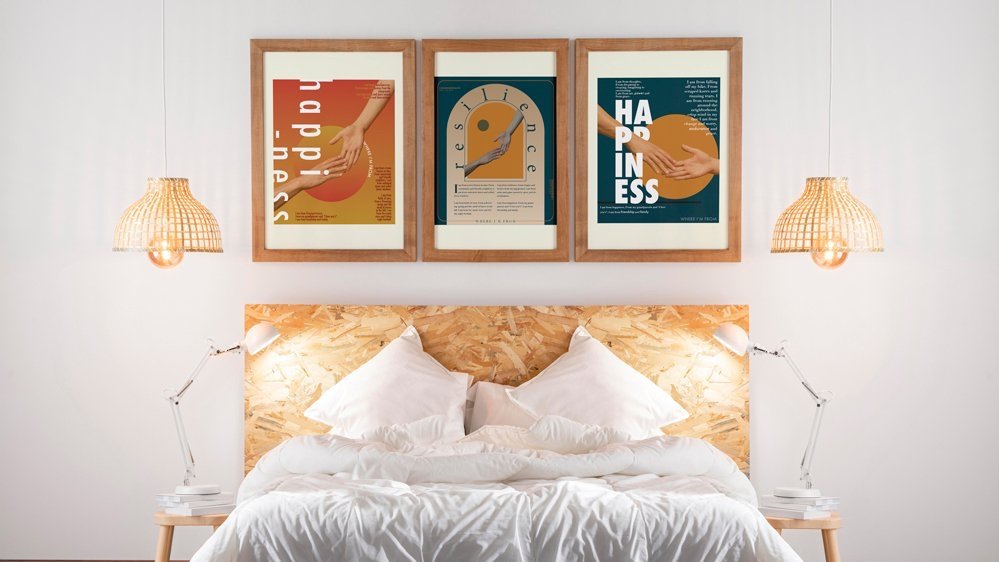
“Where I’m From” Typographic Exploration Project
The objective was to create a series of posters that highlighted a poem I wrote called Where I'm From. The main goal was to create hierarchy through contrast and the use of a modular grid. The problem that needed to be solved is that one poster but be set in sans-serif, another in only serif, and the last set in a combintion of both. The project started by creating a mood board, then mapping out shapes and designs that I thought represented the feeling I get observing both sans-serif and serif type.
WHERE I’M STARTING
FINAL POSTERS
The main goal for the posters was to create an immersive and emotional viewing experience. By making each poster unique while still cohesive, the next goal would be to try to find a way to connect the audience with not only the poem, but the design enhancing the poem. This lead to establishing a distinct color palette and a photo that would connect the poster series.
SETTING THE MOOD
When sketching things out, I knew I wanted a few elements: hands reaching for each other, geometric pieces, and bold type. In each sketch, the circle motif is present as the focal point, and the hands play a huge role in the emotion of the poem. I knew I wanted this imagery to reflect the feeling from the poem, not directly illustrate it.


